How do you choose the right frame for a landscape print? Mounting a high quality frame around a landscape print can create an impressive piece of wall art. When done right, it can make the print really stand out and transform a room interior. However, the framing options are so numerous that it can be difficult to decide which one fits your landscape print best. Using quality materials alone does not guarantee a great result. The frame and liner type must be carefully selected in order to bring out the best in the print. This article gives you practical tips on making the right choice. If you are considering having a landscape print framed but are unsure which frame would best compliment it, keep reading.
Whether you should frame a landscape print, or not, can be answered in different ways. Personally I don’t believe there is one right answer. Therefore, I would not tell any of my customers they should, or should not, frame a print. There are benefits to either option. Here are some thoughts on each side of the argument:
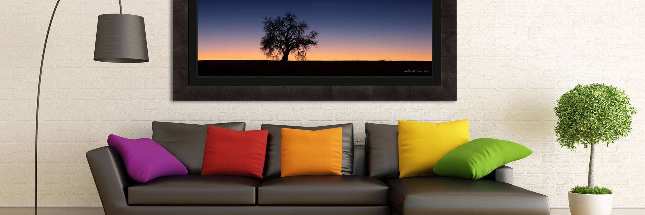
Any time a piece of wall art is framed it creates a separation between the art and the wall. It marks a clear delineation between the print and the rest of the room interior. When done well, the frame makes the art print stand out. It guides the viewer’s eyes straight onto the image itself.
A frame around a landscape print also makes it more complete. It adds an element of wholeness around its contours that accentuates the art in a more prominent way.
Finally, framing a landscape print properly can bring a classic fine art gallery, or museum, style mood to the room. It makes a powerful statement, which can cause the wall art to dominate the interior in a very positive way. A large format, framed landscape print can literally transform a room in a way that few other forms of home decor can.
As I have written in Understanding the Value of Nature Photography Prints, that the value of art is subjective. The frame of a landscape print is part of the art and the value it brings is also subjective. Some people simply prefer the look of frameless prints. There is nothing wrong with that. If you are one of those art collectors this is a reason to not have your art print framed.
Another reason to not frame your landscape print is because you want a clean, simple, and minimalist style. Some people prefer just that. In addition, if your room already has that contemporary look and feel to it, a fine art gallery style print may not fit best.
A third reason you may skip the frame, with the purchase of a new landscape print, is cost. Adding a frame to any art usually costs more. Placing a cheap frame on an expensive print does not make sense. Therefore, a good quality frame will add to the price tag. Furthermore, frames add to the overall art physical dimensions and weight, which adds to shipping costs. For these reasons, if you are working with a limited budget you may want to buy a frameless, ready to hang, mounted print.
When we examine the industry landscape for print frames the options are quite vast. There are literally thousands of frame styles. Among others, they vary by profile, width, color, and material.
This article is not meant to focus on the examination of all frames styles however. It aims to give examples of what I call “gallery style” frame options. The highest quality kind that you will see in a fine art nature and landscape photography gallery. My goal is to provide recommendations for the art collector within some of those options. I aim to provide advice on choosing the best frame for your landscape print.
Get a FREE art consultation for your landscape print framing needs. I can help you choose the perfect frame to match your style and space.
Just as there are multiple frame type options for landscape prints, there are different variations in the framing approach. Here I consider the two most common types:
This style is used when there is no border between the outer edge of the print and the inner edge of the frame. It creates a little simpler overall look and tends to work better with flat and clean contemporary frames. This scenario is out of the scope of this article.
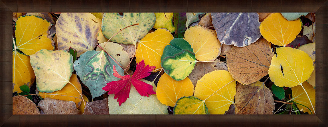
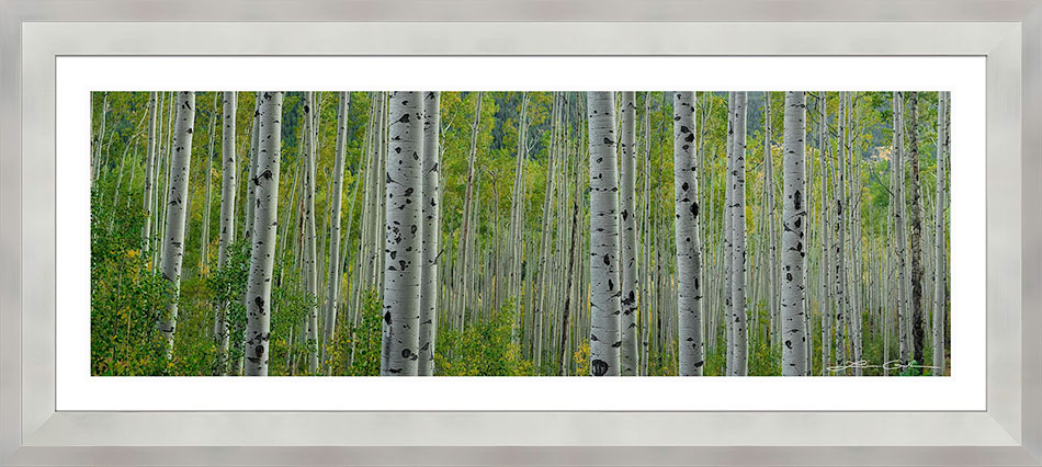
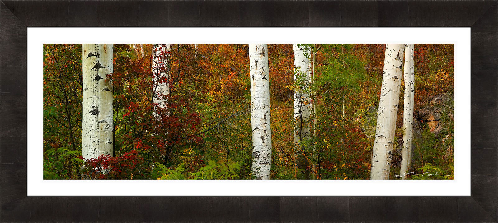
Fall Aspen Foliage | Kebler Pass, Colorado | FINE ART PHOTO PRINT – LIMITED EDITION 100
In this case there is space between the landscape print and the frame. Usually that space is filled with a liner or a mat board. The liner is a textile fabric stretched over a wooden frame, and sits between the print and the actual frame. Liners are commonly seen on high end framed fine art photography and are more expensive. The mat board (or mat) is made of layered paper board, which can come in various textures and colors.
This style of framing opens many possibilities for combinations of frames and liners. They do not work equally well. Therefore, choosing the right frame/liner/photo combination is an art form itself. The section below outlines some examples and is followed by recommendations.
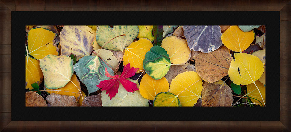
Fall Aspen Foliage | Kebler Pass, Colorado | FINE ART PHOTO PRINT – LIMITED EDITION 100
Buying an expensive frame for your fine art landscape print alone, does not guarantee an impressive final result. Some combinations work better than others as there are different factors affecting the outcome. In the sections below I examine combinations with various options for: image brightness, wall brightness, frame brightness, and liner color.
It is important to mention that there is no way I can explore every single possibility because the options are endless. However, I focus on some of the most basic scenarios. Let’s take a look at a few examples:
A landscape photographer works with all types of light, which produce many kinds of images. Some are bright, others are dark, yet others are somewhere in between. Nevertheless, the overall image brightness affects the choice for selecting the right framing combination.
In the examples below all things are equal, except that the first image is brighter and the second is darker.
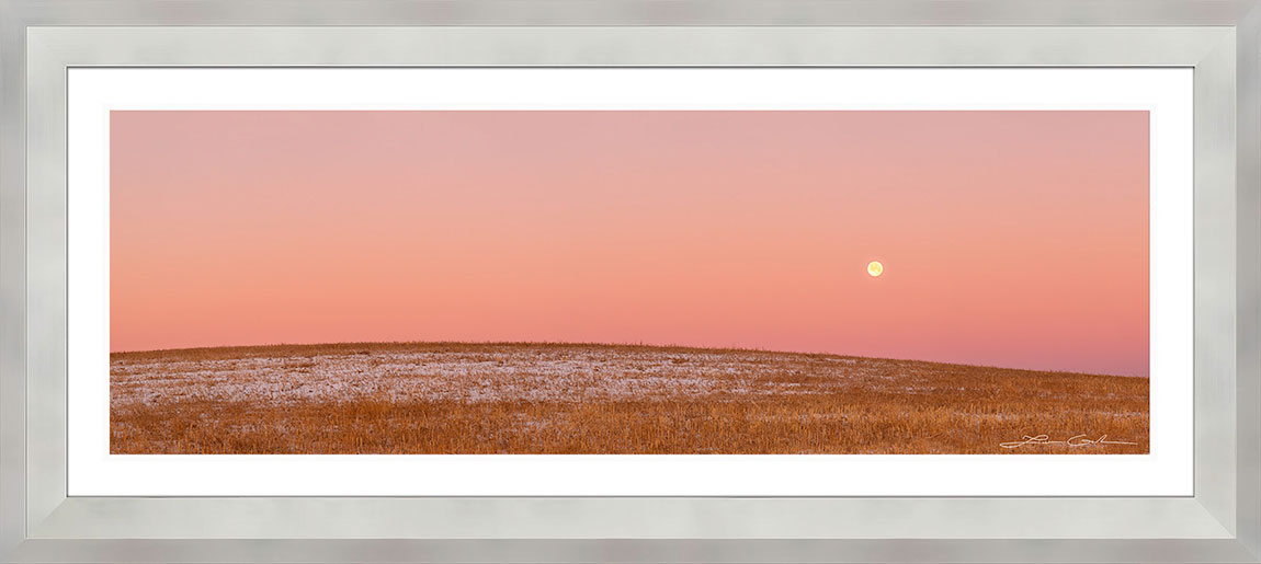
Full Moon Landscape | Colorado | FINE ART PHOTO PRINT – LIMITED EDITION 50
Rich Fall Colors | Crested Butte, Colorado | FINE ART PHOTO PRINT – LIMITED EDITION 100
Observe how the first one (the brighter) works better in this case. At the same time, the second (darker) image seems to overwhelm the bright liner and frame. It almost makes the frame unnoticeable. I believe that darker images work better with darker frames and liners in general.
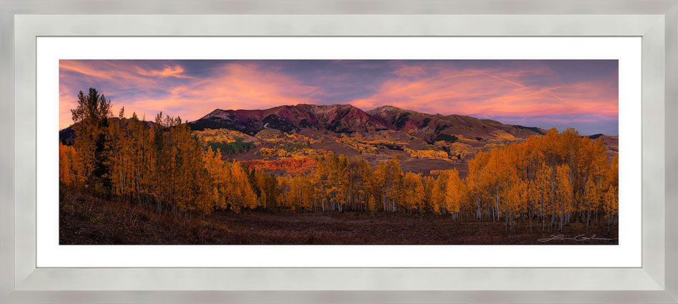
The wall color, on which the framed print will be hung, also makes a difference. While room colors come in all hues and tones, I will focus on simply bright vs dark neutral colors. Take a look at the examples below. Which one do you like better?
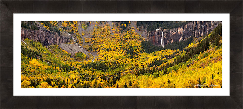
Bridal Veil Falls | Telluride, Colorado | FINE ART PHOTO PRINT – LIMITED EDITION 50
Bridal Veil Falls | Telluride, Colorado | FINE ART PHOTO PRINT – LIMITED EDITION 50
In the first example the wall and the frame have similar darkness level. This combination removes any contrast between the two. The wall almost absorbs the frame, which defeats the purpose of having it in the first place.
However, in the second example there is a nice contrast between wall and frame because the wall is brighter. The difference is very visible and now we have a nice separation which makes the wall art very prominent.
The brightness of the frame also affects the final look of the landscape print on the wall. Similarly to the examples above, the goal here is to create some separation between frame and wall. If their color choices create low contrast the overall look will not be that great. This time you will see 3 examples. Wall, liner, and image are the same across the board and the only thing different is the frame.
Independence Pass | Aspen, Colorado | FINE ART PHOTO PRINT – LIMITED EDITION 100
Independence Pass | Aspen, Colorado | FINE ART PHOTO PRINT – LIMITED EDITION 100
Independence Pass | Aspen, Colorado | FINE ART PHOTO PRINT – LIMITED EDITION 100
In the 1st and the 3d example we see nice contrast and the art stands out. However, I would say that in the second example it is not so much the case. The frame’s brightness is similar to that of the wall, and this is not helpful. If I had to rate these 3 examples, starting with the best, I would rate them this way: 3, 1, then 2.
The last component I would like to mention, affecting the final look of a framed landscape print, is the liner color. Again, liners and mats come in numerous tones and hues, but the most classic ones are black or white. Therefore, I will focus on these two.
Full Moon Landscape | Colorado | FINE ART PHOTO PRINT – LIMITED EDITION 50
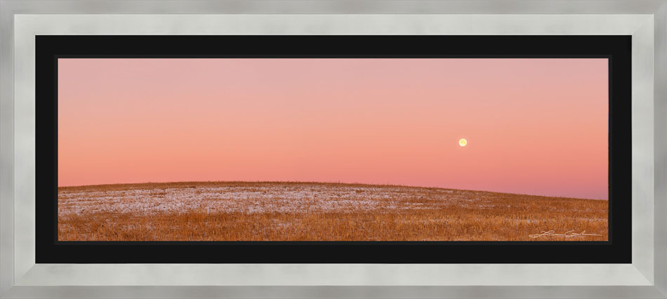
Full Moon Landscape | Colorado | FINE ART PHOTO PRINT – LIMITED EDITION 50
Notice how elegant the first example is with a white liner. However, if we change it to a black liner it drastically changes the look for the worse. The black liner is so dominant that it overpowers the frame and almost ruins the entire look.
Now let’s examine the reverse scenario, where the black liner actually works better.
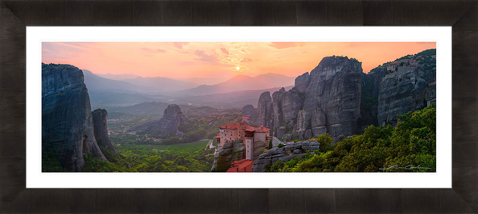
Meteora Sunset | Greece | FINE ART PHOTO PRINT – LIMITED EDITION 100
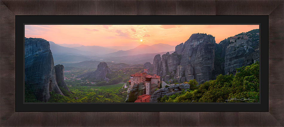
Meteora Sunset | Greece | FINE ART PHOTO PRINT – LIMITED EDITION 100
Observe how the white liner is a little distracting. Because this image has more intense darker colors, the overall contrast is a bit strong. Human eyes are naturally drawn to brightness and colors. Given that neither the colors, nor the brightness in the image are strong, our eyes are more drawn to the liner because it is brightest.
On the other hand, the black liner fits much nicer. Instead of drawing attention to itself (as does the white one), it guides your eyes straight into the image, which is exactly what we want. Now we get the feeling of looking through a window, into the beauty of Meteora.
Get a FREE art consultation for your landscape print framing needs. I can help you choose the perfect frame to match your style and space.
When you are choosing the right frame for your landscape photo print it is worth doing it right. You want a striking combination that compliments the image and your home interior. If you are investing in a fine art landscape print, it is worth choosing a frame that will make the art stunning.
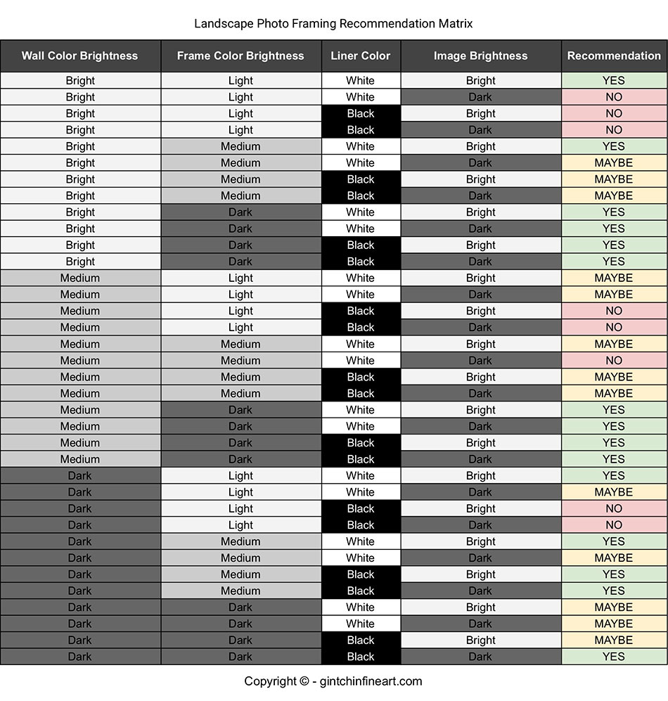
Given the above 4 elements: wall brightness, frame brightness, liner color, and image brightness, I would like to provide some simple guidelines:
In addition, I am providing a simple matrix (see below). I am using some of the more common scenarios and it is by no means an exhaustive list. If you have 4 elements to play with, and each can come with multiple options, the possibilities will be limitless. Therefore, I outline only 36 variations.
Keep in mind that these are my personal recommendations as a fine art nature and landscape photographer. There is no scientific formula here and this is my opinion. If you go and ask 10 different people on this subject you might get 10 different answers. However, what you see here is what I believe works and what doesn’t work.
My hope is to provide a simple way to help you quickly narrow down the right choice for you. My advice is to avoid the combinations that I have indicated with “NO” in the “Recommendation” column. When it comes to the “Maybes”… you will have to decide what works best for you. Anything marked with a “YES” I believe has the strong potential to make a powerful statement on a wall.
In the section below I have compiled some examples that I believe work really well. Enjoy!
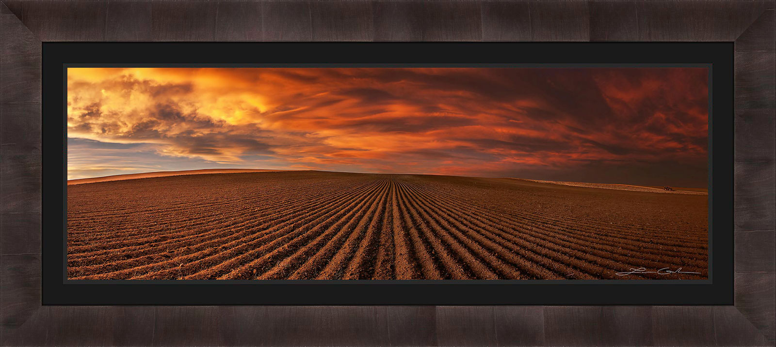
Dramatic Skies | Boulder, Colorado | FINE ART PHOTO PRINT – LIMITED EDITION 100
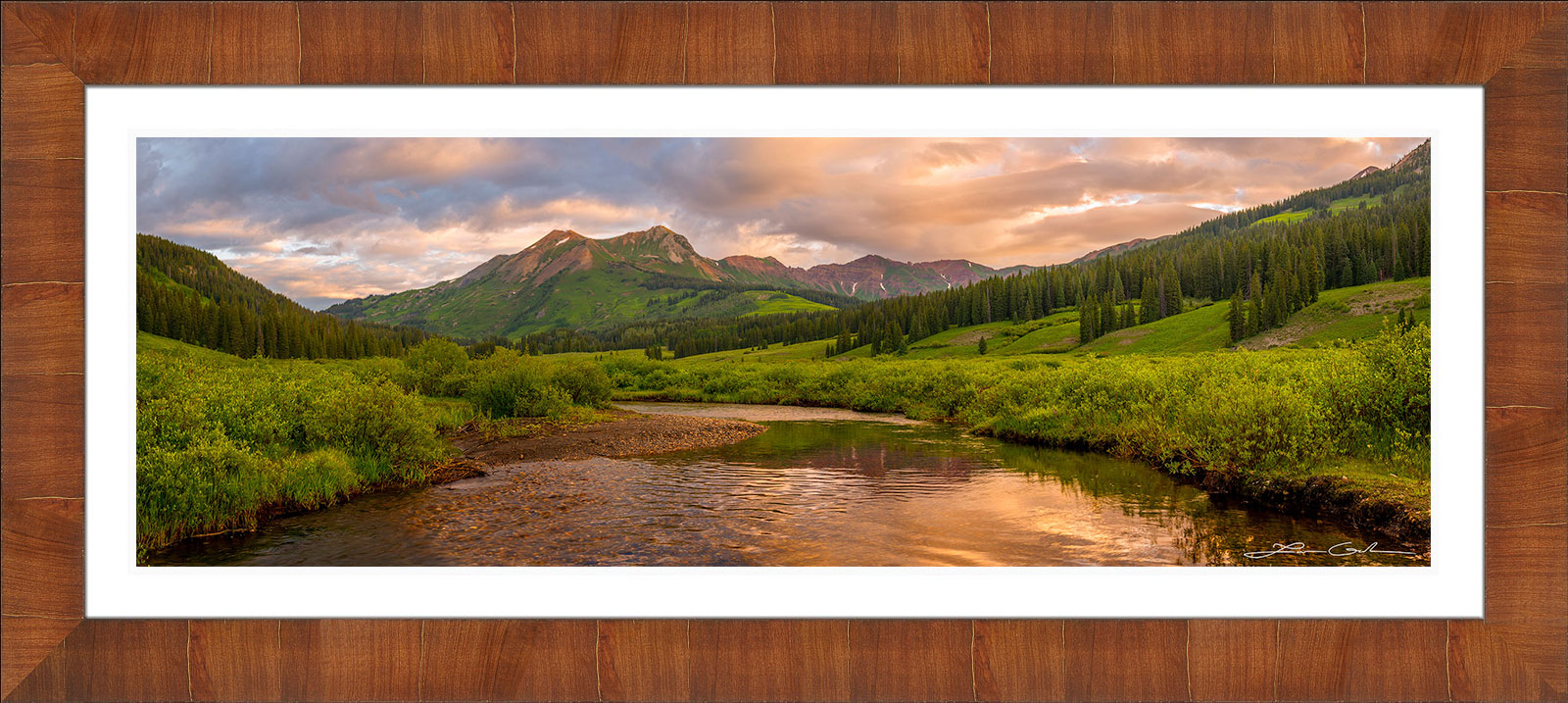
Mt Bellview | Elk Mountains, Colorado | FINE ART PHOTO PRINT – LIMITED EDITION 100
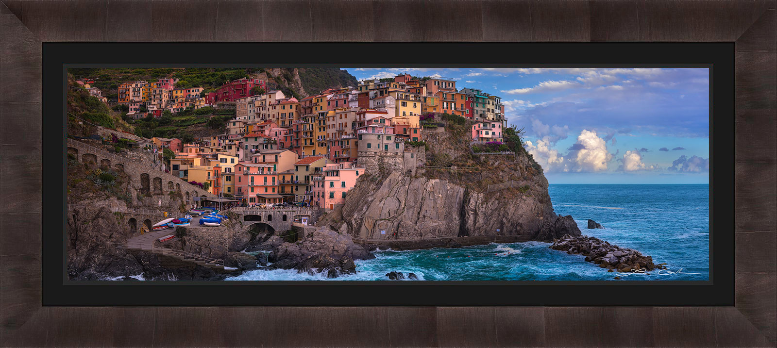
Manarola | Cinque Terre, Italy | FINE ART PHOTO PRINT – LIMITED EDITION 100
Independence Pass | Aspen, Colorado | FINE ART PHOTO PRINT – LIMITED EDITION 100
There are some additional items you may want to consider when choosing the right frame for your landscape print.
The color of the frame sometimes can nicely compliment the image if similar colors or tones are found in the photograph itself. The color of the frame can also compliment the interior if the room has any decor with matching colors. On the other hand, there are some cases where a particular color may not work well with an image. One example is a warm color frame with a predominantly cold color image or vice versa. I find that colorful images work well with neutral colored frames like dark and gray. They also work well with non-neutral colored frames, which match the color tones in the image.
Furthermore, the liner can slightly change the mood of the overall art statement. For example, you may have a combination that works well with both a white and a black liner. However, you will notice that the black liner creates a little bit of a more serious mood that commands respect. While the white liner is more light-hearted and elegant, the black is more gripping and demanding acclaim. Neither is wrong or right, but they can slightly affect the overall mood. So then it comes down to your preference.
This article is meant to guide your choice of frame for a landscape print, and not to prescribe. As I mentioned above – choosing the right frame for your art, is art itself. There is no black and white formula and it takes a keen eye to discern the best framing selection in any situation. My hope is that the tips I have provided prove helpful to you.
If you are stuck, it is always valuable to visualize the art choice on your wall. If you don’t know how to do that, read How to visualize fine art prints on your wall?. Finally, if you are considering buying any of my fine art landscape prints I would be happy to assist you in the right frame choice. Feel free to reach out and let me know how I can help.
Get a FREE art consultation for your landscape print framing needs. I can help you choose the perfect frame to match your style and space.