Whether you are an interior designer or an art collector, you have decided to use fine art nature photography for interior design. Your goal is to create an impressive statement and transform a home or office space with a striking landscape print masterpiece. Which interior design components and nature photography print aspects should you consider? How can you make the most with the space and resources you have? Keep reading and learn how to create the best visually appealing interior design impact.
Interior design enhances the interior of a space by creating a more aesthetically pleasing atmosphere. Interior design has many facets and I would argue that fine art nature photography can be a great facet.
You can completely transform a home or office room with a gallery quality large format nature print. Often we go to great measures to redesign an interior space by changing decor, color, furniture, etc. All of these transformations have their place and purpose. However, a powerful transformation can be made by displaying just a single large size print as well.
When walking into a room, with a huge and stunning nature photography print on the wall, one cannot help but immediately be drawn to it. A high quality fine art print can have the effect of a window to nature and momentarily transform the viewer into a different part of the world.
Of course, a nature photography print would work even better if other parts of the interior design space are addressed. And this is what this article is about – to show you some of those components and considerations, and help you achieve an impressive result.
Fine art nature photography prints are easy to work with, when it comes to decorating a room and interior design. Why?
They work well in most interior settings. For example, a hospital, a dental office, a corporate lobby, an office conference room, a home bedroom, a living room, a dining room, even a bathroom. In addition, fine art landscape prints decorate very well in different style homes: contemporary, rustic, country style, etc.
Furthermore, fine art nature photography prints are great for home staging in the real estate market. There is a reason why real estate agents invest in home staging, and then have the property photographed, before advertising it for sale. Having beautiful nature photography prints and well staged interior design in a home for sale can make a big difference. The prospective home buyer can be quite impressed and better motivated to purchase.
Most people enjoy looking at a beautiful nature scene. Yes, there are people who are indifferent to the beauty of nature. However, we are wired to appreciate the natural beauty of our world. There is a reason why so many natural parks and nature preserves exist all over the world. There is also a reason why people flock to them year after year. People are enthralled by those majestic and awe-inspiring landscapes.
While I don’t have a strong opinion on whether the art or the space has to be selected first, understanding your starting point will help you. When using fine art nature photography for interior design the starting point can vary. Sometimes you have the fine art picked out, but not the wall space. Other times it is the reverse. Yet in some cases, neither choice has been made, or maybe both have already been made.
Regardless of your situation I recommend that you stop and assess where in the process you are, before you begin. Understand what choices you have already made and which ones still need to be made. In addition, understand what your variables and flexibility are. In other words, do you have the freedom and ability to change things around in your interior. Things like color, interior decor, furniture, lightsing, etc.
The predominant colors of the photo print play a vital role when choosing fine art nature photography for interior design. Having one or more colors from the print match colors in the room, creates visually appealing combinations. Conversely, if the photo print colors are completely different from those of the interior space, the result will not be aesthetic. I also want to mention that when matching colors they do not have to perfectly match. As long as they are in similar tones you can create a powerful effect.
Furthermore, the color matching approaches can be quite numerous. However, I will outline 4 different scenarios below that actually work well.
The first three are similar. They create an effect where the fine art print strongly stands out and creates a focal point. When that happens the fine art landscape print on the wall demands attention and admiration and truly impresses the viewer.
By contrast, the fourth scenario is a more gentle approach, where the fine art print blends more with the room.
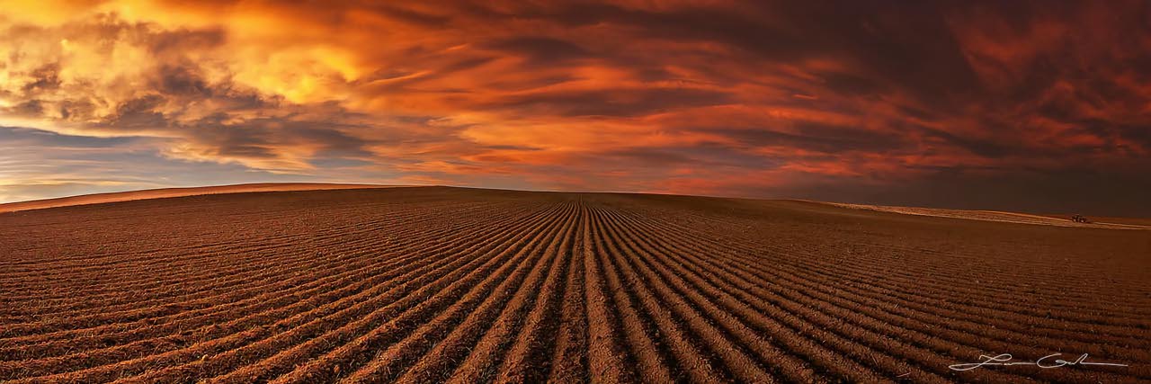
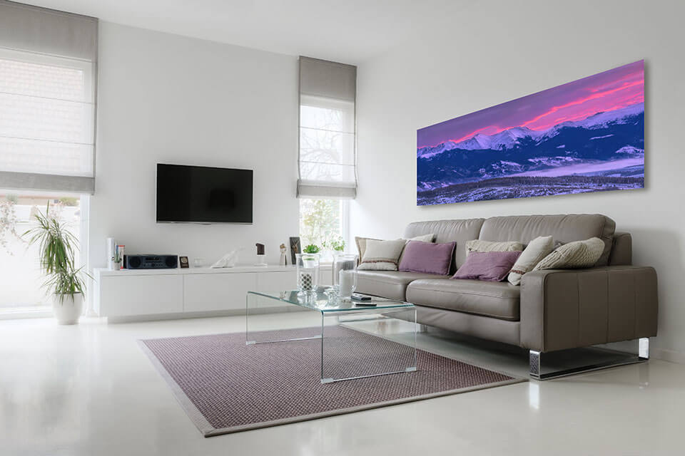
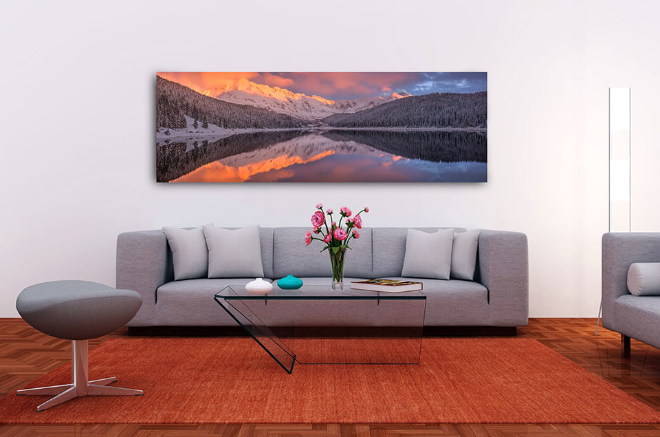
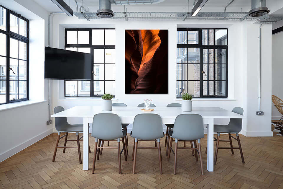
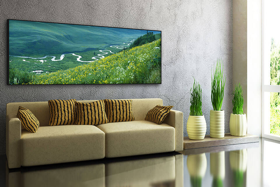
1. Focal point – bright color matching
This is when the brighter colors of the fine art photo print match parts of the room interior decor. In the first example below the bright image colors match the carpet and some of the sofa cushions.
In this second example the bright warm colors from the setting sun match the carpet and the floor.
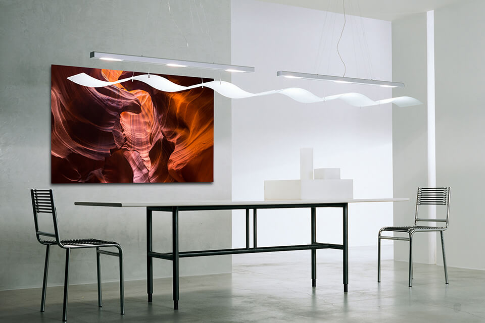
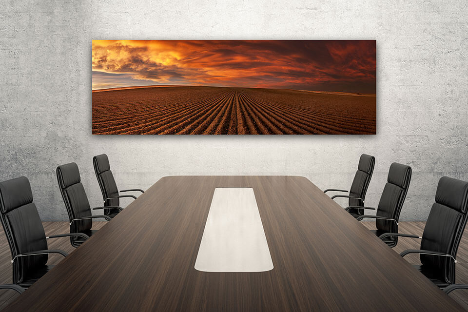
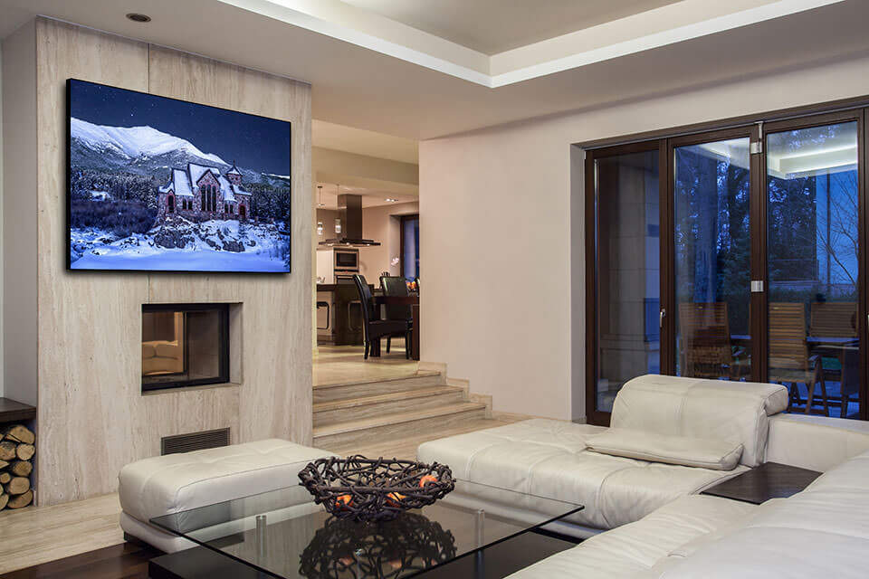
2. Focal point – dark color matching
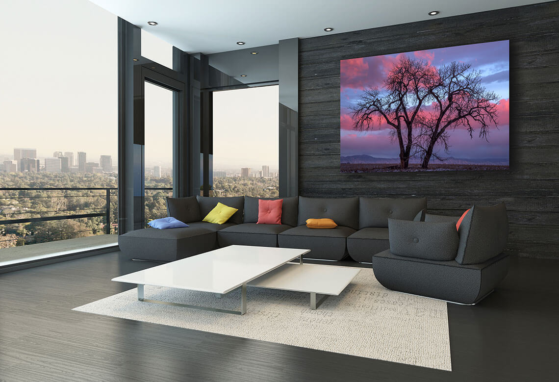
This scenario is reverse of the previous one. Instead of matching bright image colors to interior space colors, it matches dark ones. Notice that only the blacks from the fine art print match the furniture.
In this next example you see two dark colors being matched – blacks and browns. Another interesting part in this example is how the table surface lines and the image furrows go in the same direction. This is subtle but creates a strong visual effect.
3. Focal point – bright and dark color matching
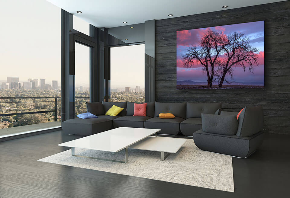
This third approach combines the previous two together. What we have is the fine art print matches both bright and dark room interior colors.
In the interior design example below, we see that the dark silhouette of the tree matches the sofa, the floor, and the wall. In addition, the blues and the reds from the sky are matched by the sofa cushions. The cushion colors is another subtle technique with a powerful final result.
4. Blended
The blended scenario, as already mentioned, is less of a standout approach. The fine art image is less of a focal point. It blends with the rest of the room rather than strongly standing out. It is not a right or wrong choice, it is just a different design style.
The wall art in the example below matches the majority of the interior space colors. It creates a blended feel. The nature photography print feels more as a small part of the interior design, rather than a major component.
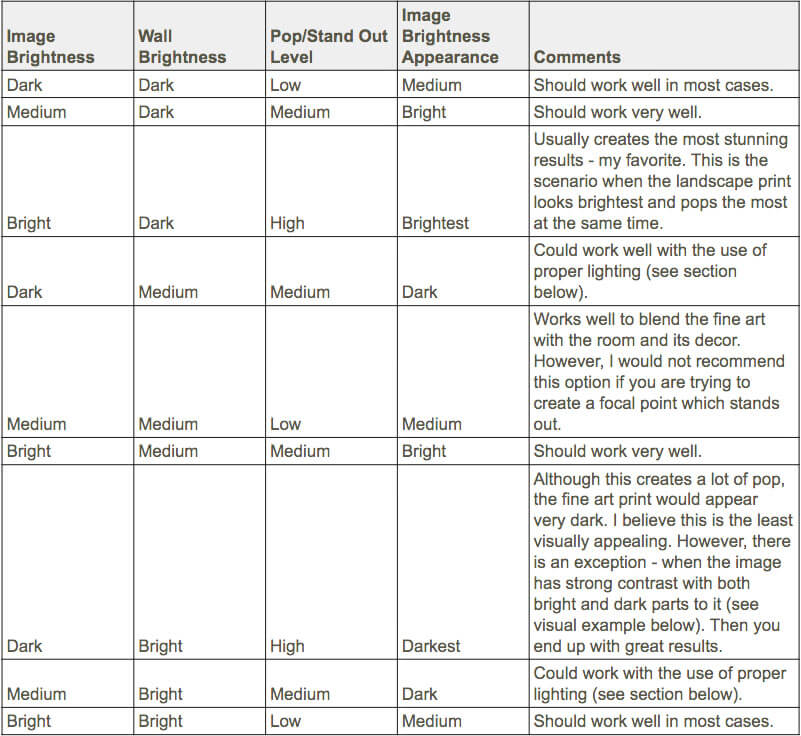
When choosing a fine art nature photography print for your home or office interior design, consider the brightness of the wall color as well. In addition, you have to factor in the print image brightness.
Why does this matter? Simply put, any time you hang a fine art landscape print in a home or office, the wall becomes the fine art background. The background brightness affects how we perceive the wall art in general.
What I mean is, the combination of wall/image brightness will affect your overall perception in two ways:
Naturally, a brighter background will make the fine art print appear darker. The reverse is also true – a darker background will make the landscape image appear brighter. Additionally, a bright image on a dark background will pop/stand out a lot more than on a bright color wall.
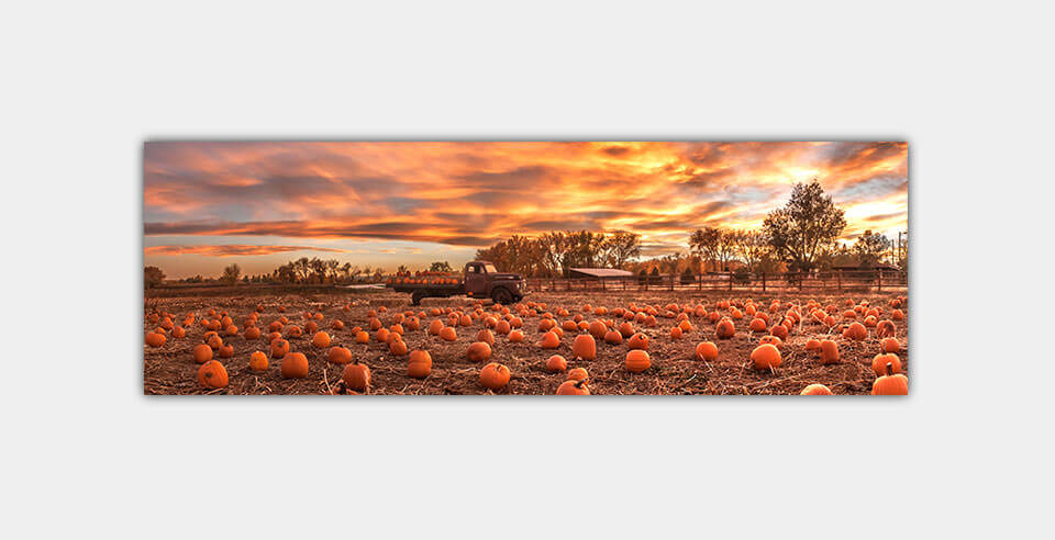
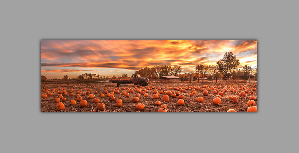
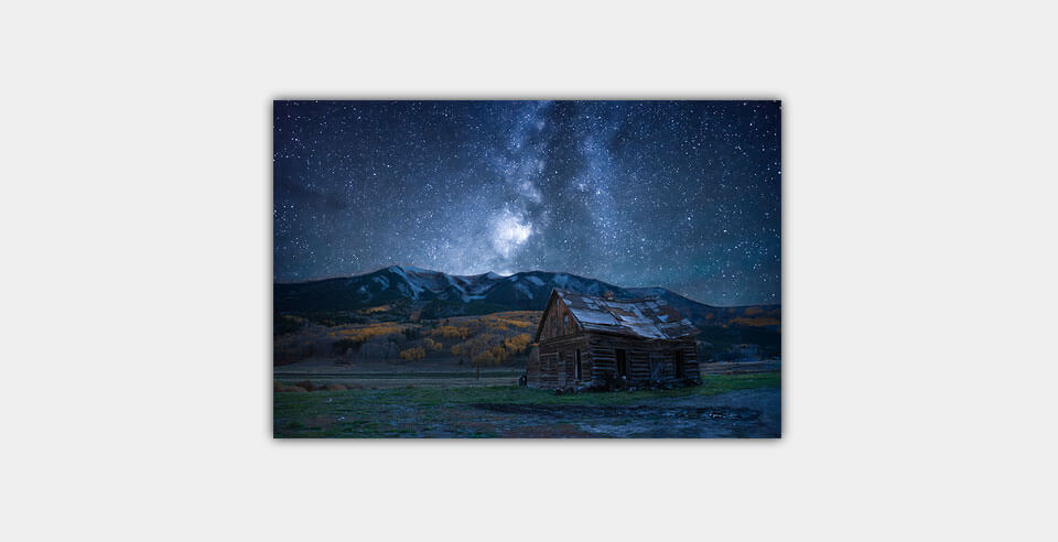
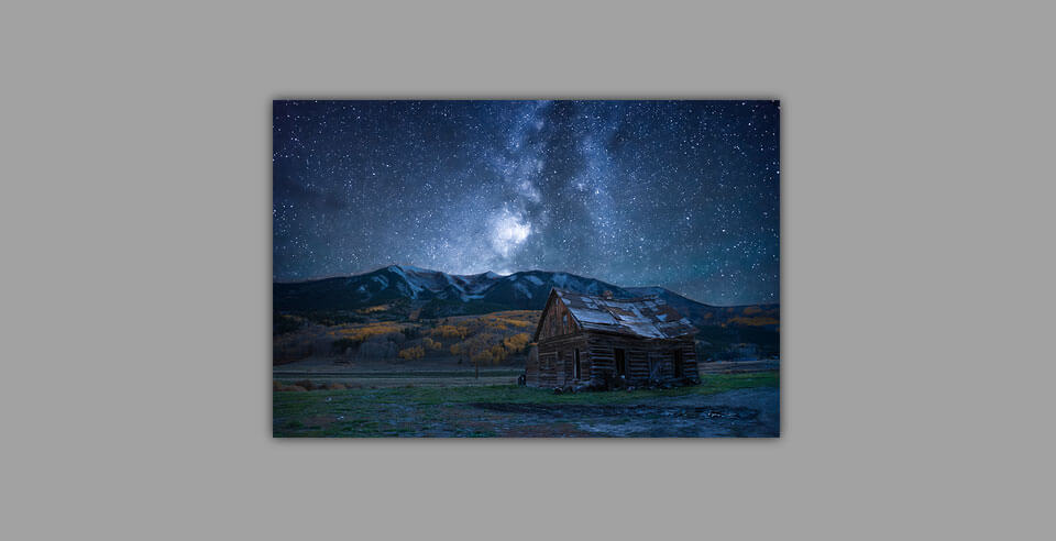
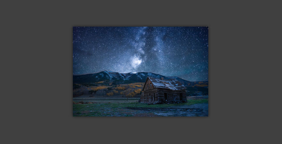
To illustrate this visually, look at the examples below. The landscape image is exactly the same. The only thing different is the background. Does the image appear to be changing brightness from one background to the next? Does it seem to pop more/less in some of the cases?
If you happen to have chosen an image, which is fairly bright you should be fine in most cases. However, the effect you saw above will be more pronounced with darker images. Let’s take a look at another example with a darker image.
Examine the table below and see how the different combinations affect both the brightness and pop/standout appearance of the image.
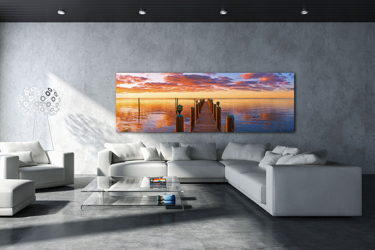
In the examples above we used one bright and one dark image. However, both images are fairly uniform in brightness. Meaning, the image is mostly bright or mostly dark. Consider a scenario when the image is rather strong in contrast. That is, when the fine art print has both very bright and very dark parts to it. This type of an image can work well even in very bright backgrounds. Look at the example below. The wall art looks quite stunning on a bright white wall.
A fine art nature photography print with strong contrast can be more versatile and look well in numerous background settings.
As you can see the wall color brightness alone impacts the appearance of fine art nature prints. But what should you do if you have your heart set on a darker image, your wall is bright, and repainting the wall is not an option?
Then I invite you to consider your lighting options. For instance, do you have any flexibility in how you can illuminate your new fine art landscape print? If so, you can use artificial light to help the print stand out more. However, understand that regardless of the print/wall brightness ratio, fine art print lighting is very important. Now matter the wall color brightness, a landscape art print will not look well in a dimly lit area. Lighting fine art nature photography prints is a component of interior design, which is a separate topic. In this regard, I have written extensively in another article. It is a complete guide with information on everything you need to know when lighting fine art landscape prints.
Another component to consider when buying fine art nature photography for interiors, is the print aspect ratio and orientation. First, let me address what I mean here and then discuss the interior design aspect.
Aspect ratio – The relationship of the length to the height of the landscape print. Some examples are: 2×3, 3×4, 1×2, 1×3, 16×9, etc.
Orientation – Whether the image is horizontal or vertical (sometimes referred to as portrait vs. landscape).
Take note that I will not discuss fine art print sizes here. While fine art print size is considered during the interior design process of a space, aspect ratio and orientation work independently of print size.
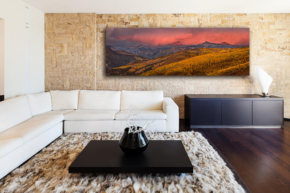
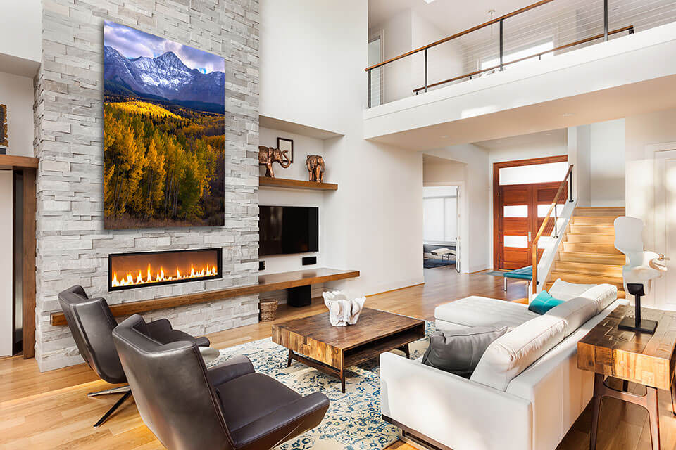
With that said, I believe the interior design is more visually appealing when the wall shape is similar to that of the nature photography print. In the previous section I mentioned that the wall on which the landscape print is displayed, serves as a background. Therefore, you can think of the wall itself as a giant mat board. Most times when a photo print is matted and framed, the mat shape follows the natural print shape. If your wall happens to mostly follow the print shape, it will be aesthetically pleasing. Below are some examples when this is the case.
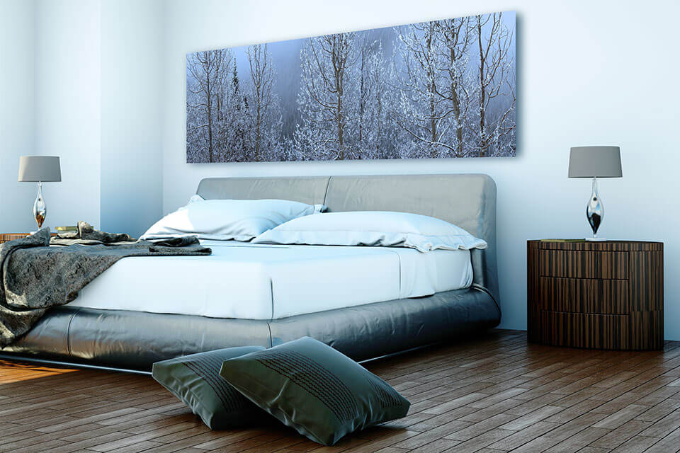
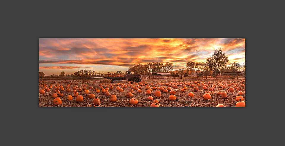
Horizontal 1×3 (panoramic) Fine Art Print
Vertical 2×3 Fine Art Print
Horizontal 2×3 Fine Art Print
On the other hand, there are exceptions and I am not suggesting that you never hang a fine art print on a wall with a different shape. For this reason let us look at an example where the wall is not the same shape, but it still looks great. The reason it works well is because the fine art print is above a couch. The couch has a similar shape and size. As a result, the furniture and the wall art compliment each other well, regardless of the wall shape.
The above examples are aesthetically pleasing. Although there are no rules here, I need to point out a couple situations when that is not so much the case. It is a situation that I would say creates an unnatural look. This happens when the wall and fine art proportions are complete opposites. For example, a horizontal panoramic image on a narrow vertical wall. It leaves a lot of empty wall space below and above the print, and little space on the sides.

The reverse scenario might also look unnatural. This would be the case with a wide long wall and a single vertical print on it. In this scenario there would be lots of empty wall space on the sides of the print in comparison to the space above and below it.

If you have this type of a wall and like vertical images, consider having multiple prints on the same wall. Like the example below.

During the interior design process, grouping fine art nature photography prints can be a very effective technique. The reasons for using it can vary. Sometimes you just happen to like more than one image from the same photographer. Other times, you have a large wall and prefer to fill it with multiple smaller prints, rather than a single large one. Yet other times, you may just really appreciate the look and feel of grouped images as wall art.
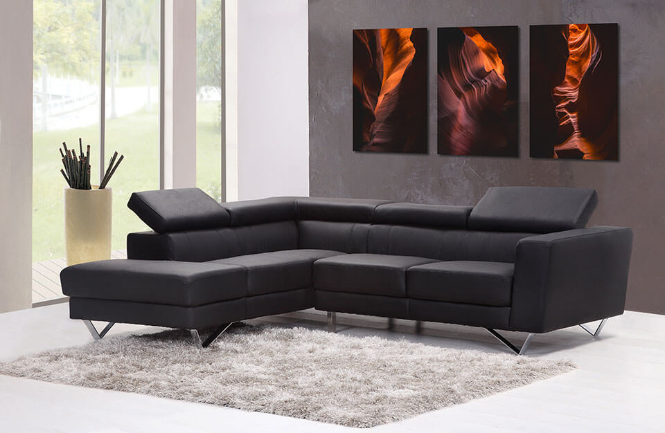
A triptych can be a form of fine art prints grouping, but most commonly it is when a single image is split into multiple panels. Usually they are vertical or square. I believe there are two common reasons to do a triptych. One, the art collector purchasing the fine art landscape print really likes this style. Two, the overall size of the fine art print is larger than the printing capacity of the printer and it has to be split into pieces.
Read more: What is a Triptych Print?
I would recommend that, when grouping fine art landscape prints, equal shapes and sizes be used. That means, using equal size rectangles or squares instead of mixing them. Also, I believe that when they are the same orientation (horizontal vs vertical) the final look is more stylish and high-end.
There are ways to mix and match size and orientation (see example below). However, my personal opinion is that those are more suitable for family and portrait pictures, rather than elegant fine art nature photography display.

If you plan to group fine art nature photography prints for interior design you need to consider the types of images you are grouping. I would not recommend mixing landscape categories. For example, grouping a mountain with a beach. Or, beach and a desert. It works much better if the images are of the same style, either by category or color, or both.
Some landscape photographers will photograph the same location in different seasons. This works well because each fine art print image has the same features, although the colors are different.
Another style that works well is when the grouped image prints are of different shape features, but similar or same colors. For example, images of flowers, water, leaves, etc. Yet another approach is – different images of the same location with the same colors.
You can group as many fine art prints together as you like however, not all scenarios will be equally pleasing. I believe that 2 to 5 prints grouped together works best. Less than 2 is not a group and more than 5 in my mind is an overkill. Personally, I like three prints together if a group will be made.
So far I have tried to capture all aspects and components to help you make the best choice when choosing fine art nature photography for interior design. My goal is not to prescribe what you should choose, but rather help you select what works best for you. Below I offer some final thoughts to wrap everything up.
Whatever you do, do not buy a fine art landscape image that you don’t like. Even if it fits perfectly from an interior design standpoint, if you don’t like the nature photography, don’t get it. Plain and simple – you have to appreciate the photograph. You will be the one who looks at it every day and it is very important that you like what you see.
Getting a high quality fine art print for your wall makes a big difference in the final result. Gallery quality fine art will look great in most interiors. In contrast, a low quality art print will not look elegant, even in the most stylish interiors. Because of this, I would recommend that you go for the highest quality fine art print that your budget allows.
The information I have provided is meant to inform you, not overwhelm you. If you find yourself stressing over every little decision you may be overdoing it. Decide what you like, what you are willing to change and what not, and go for it. At the end of the day, what is most important is that you like looking at your new nature photography fine art print. Don’t forget to have fun in the process either!
If you are reading this article you may be looking for the perfect landscape print for your home or office. I pride myself on offering limited edition gallery quality fine art to my customers in very large format sizes. I work very hard to offer premium style nature photography prints, boasting detail and color vibrancy meant to impress. Thank you for spending time on my website. I invite you to browse the fine art nature photography online galleries.
Gintchin Fine Art offers a no-obligation, complimentary 30 minute photography art consultation. Buying the right photograph, print size, print medium, and frame option is important when transforming a space. If you feel challenged in your choice as an art collector, I am here to help. Having placed my prints as wall art in home, office, corporate, and gallery interiors, I am confident that I can find a solution which will meet your unique needs. Take advantage of my experience and skills, and request your no-pressure art consulting session today.